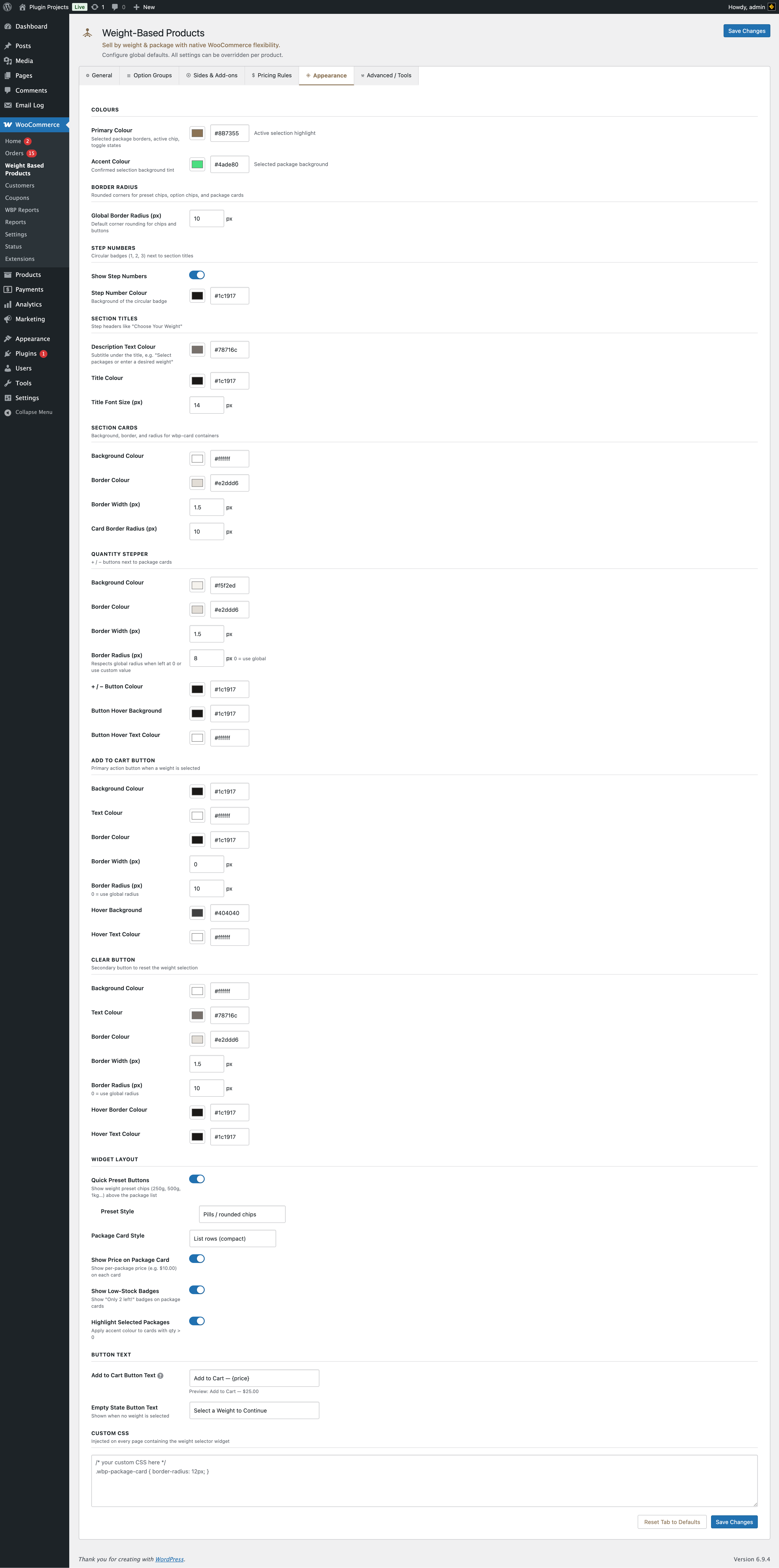
Colours
Primary colour — Selected package borders, active chip, toggle states. Accent colour — Confirmed selection background tint (e.g. selected package background).
Border radius
Global border radius (px) for preset chips, option chips, and package cards.
Step numbers
Circular badges (1, 2, 3…) next to section titles (e.g. “1 Choose Your Weight”). Toggle “Show step numbers” and set “Step number colour” (background of the badge).
Section titles
Step headers like “Choose Your Weight”. Options: description text colour (subtitle under the title), title colour, title font size (px).
Section cards
Background, border colour, border width, and card border radius for the weight/options card containers on the product page.
Quantity stepper
+ / − buttons next to package cards: background colour, border colour/width/radius, button colour, and hover background/text colour.
Add to Cart button
Primary action when a weight is selected: background, text, border (colour/width/radius), hover background and text. Border radius 0 = use global radius.
Clear button
Secondary button to reset weight selection: background, text, border, hover border and text colour.
Widget layout
- Quick preset buttons — Show weight preset chips (e.g. 250g, 500g, 1kg) above the package list.
- Preset style — Pills/rounded chips, Rectangular buttons, or Tab strip.
- Package card style — List rows (compact) or Card grid (visual). Per product you can override this under General Options → Pack list display (Fixed Packs only); otherwise the store default applies.
- Show price on package card — Per-package price on each card.
- Show low-stock badges — “Only 2 left!” on package cards.
- Highlight selected packages — Accent colour on cards with quantity > 0.
Button text
Add to Cart button text — Use {price} for dynamic total, {weight} for total weight. Empty state button text — Shown when no weight is selected (e.g. “Select a Weight to Continue”).
Custom CSS
Injected on every page that contains the weight selector widget. Use to override styles (e.g. .wbp-package-card { border-radius: 12px; }).